Ceramics, Print and a very British Industry: A personal journey into a love for ceramics and print …and combining them together!
To begin writing this post, I dusted off some files and delved back into my first dissertation - from a good few years ago! Still an academic at heart!
During my BA degree I could be found spending many hours on end in the beautiful, light and spacious print centre at UWE’s Bower Ashton campus in Bristol, overlooking Ashton Court’s deer park and becoming absorbed in the process of printmaking. What I most loved about print processes were the tools and materials of the trade: the rich, vivid colours of the tactile inks and the weight of the old machines and presses as I trained them to form an image upon the page.

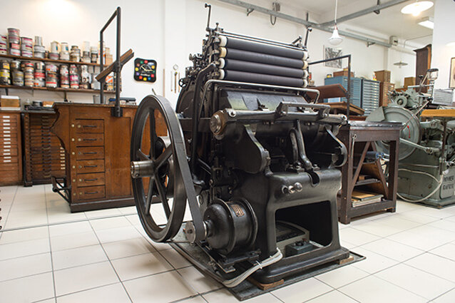
I have long been fascinated by industry: the forms; the graphics; the visual repetition of large batches. It might be found in the bright, clean logos of printed packaging; crates stacked high as they prepare to ship; monumental cranes or scaffolds interrupting a cityscape; the coloured ‘building block’ shipping containers at a port. Perhaps this fascination is an arbitrary thread linking to the time of the Industrial Revolution: My imagination somehow sparked by the desire to express a story of urbanisation – a strange, idealised notion of the power, opportunity and scale of futuristic machines. The song “Yoshimi Battles The Pink Robots Pt 1” by The Flaming Lips comes to mind.

Rolling printing ink onto lithography block
Transferware and tissue printing ceramics
I wouldn’t call myself especially patriotic, preferring to receive and embrace the diverse melting pot that globalisation has gifted us. Still, it would be remiss to deny my cultural heritage in the history of ceramics - England lays claim to a unique and significant place in the tradition of decorative ceramics.
Transfer printing ceramics actually began in England in the 1750s, in Staffordshire in particular – which is where the larger EK Colours batches of ceramic prints are still made, when not printing and applying our own.


In the 17th century, tea was adopted from China as the beverage of choice in the West, and with it, the infamous blue and white pottery from the likes of Spode china. The cost of rare Cobalt pigment and hand painting methods meant this tableware remained an expensive preserve of the elite. As ceramics production was refined and industrialised, a process was developed for making Cobalt pigment, called ‘Smalt’ and along with it - the invention of tissue transfer printing.
A flat copper plate was engraved with a design - once the plate was inked with a ceramic colouring, this was impressed to a thin sheet of tissue paper. The inked impression was then transferred onto the surface of the ceramic object.
EK Colours’ tile colour choices are in part a response to the tradition of blues and whites in British ceramics. The rich blue surface designs also draw influence from 20th century artists such as Yves Klein, Piet Mondrian and Henri Matisse and further still refer to the primary colours expressed in the Bauhaus and Constructivist movements.


Given my role as ceramic tile and surface designer, I consider myself privileged to have trained in a print facility that pioneered an effective ‘water-slide’ ceramic paper. As students, we were able to safely and easily screen print our own richly coloured, non-toxic ceramic transfers or ‘decals’, combining bright on-glaze powders with water-based printing medium. After overprinting a ‘cover-coat’, printed images could be soaked in water and then slid off the paper backing and onto the glazed ceramic surface.
I was also grateful to meet Kevin Petrie (PhD) who helped to develop this transfer printing method, upon visiting Sunderland’s impressive Glass and Ceramics facility - housed in the vast factory-like space of The National Glass Centre. I later went on to study under professor Rob Kesseler at Central St Martins college, whose ceramic art specialises in decal-ware.
It is now widely accessible to print digital ceramic transfers, although traditional screen prints do maintain a superior surface richness. U-wet transfer paper for screen is available through paper merchant John Purcell Paper in London.

Ceramics as a vehicle for imagery and meaning
Ornament, or decoration has been the subject of contentious debate throughout the 19th and 20th centuries. It is primarily seen as the embellishment of functional forms and therefore a characteristic of the applied arts, which encompasses everyday objects and architecture.
The modern perception of ornament as mere decoration emerged with the Industrial Revolution. The primary concern for Modernist design was to affirm the beauty of function and necessity, expressed in Louis Sullivan’s theory that “form follows function”. Industry provided the perfect system in modernist utopia, as purposeful utilitarian forms were intended to reflect the clean, minimal designs of the machine aesthetic. The International Style journal, in 1932 stated that one of new architecture’s main constituents was “the avoidance of applied decoration”. In stark contrast, critic Sir Herbert Read equates the very absence of ornament with “the poverty of everyday life” (3).
Having been omitted from avant-garde art movements, decoration saw a revival with the rise of postmodernism, which embraced popular culture and eclectic visual styles

Cumbrian Blue(s) Sellafield No:9, Paul Scott
Postmodern ceramic artists carved a unique place on the boundary between both ceramics and contemporary art fields. By accepting traditionally craft-based forms such as ceramics into their ‘high art’ repertoire, these artists integrate the disciplines. Inversely, trained studio potters broaden their scope for ideas, an example of whom is Paul Scott, who subverts ornamental traditions by applying contemporary contexts into the ubiquitous Spode-ware style.
In Clare Twomey’s installation Complacent Familiarity, her ceramic handguns are essentially art objects - they express languages of art, industry and craft in a conceptual context. It is actually the incongruity of the piece that provides it with its impact and Twomey’s political intentions in the piece are driven home as she reproaches society for its violence and apathy.
Complacent Familiarity, Clare Twomey 2000


